Friday 26 November 2010

Looking back at your preliminary task, what do you feel you have learnt in the progression from it to the full product?

When we first started out preliminary task, I didn't have much knowledge of Photoshop and didn't know how to make things look professional and add effects such as shadowing. However, throughout the process of making my magazine, I feel I have learnt a great deal of skills on both Photoshop and Indesign.

One factor I have definintely improved on is  my cutting around images on Paintshop, using the pen tool:


This was the first image I cut for preliminary task. The cutting is unaccurate and there is still traces of the background. I also didn't take as much care and time on cutting around this image.

This is my front cover image. I have cut this much more accurately and made sure there is none of the background of the photo showing. I also used the rubber tool to smooth out any sharp edges to make it look more accurate and proffesional.

Another skill I have learnt is how to experiment with editing photos, for example, I changed the photos below using the contract/brightness tool and ended up with different coloured images:


I also discovered effects such as 'shadowing' and 'outer glow' which I used a lot on my headings and on my masthead. I didn't know about this technique when I made my masthead for my preliminary task so therefore, my masthead didn't stand out as much and didn't look as appealing as my masthead on my final magazine:


Although on my first masthead, I used an effect, it wasn't as effective as my final masthead which is simple, but bright and bold and appeals to my target audience.
(You can't see shadowing on my final masthead because it doesn't show on this blog).

My use of both Photoshop and Indesign have improved a lot since the start of this process. I have learnt how to edit and maniupulate photos, for example, changing colour photos into sepia, greyscale, etc, or simply changing the contrast. On my preliminary task, I kept the photos as they were, and some were not of a good quality, but on my Final Magazine, I learnt how to edit the photos so they looked much more professional and so they matched with the colour scheme of my magazine. For example, I used photoshop to change all of my images on my contents page to greyscale, as they fitted in with my colour scheme more sucessfully than when they were in colour. Compared to my preliminary task, my final magazine is much more matched and the colours go together, whereas my first magazine l0oks messy due to the overuse of bright, vibrant colours. I have now leant to contrast bright colours with darker colours such as black and white - this still looks eye-catching, but keeping is simple sometimes looks more professional which was one of my aims of my magazine.

Another skill I have learnt over this process is my photography skills. My preliminary task contains messy, unedited photos, however, I prepared the photos for my final magazine more successfully, ensuring that the outfits and props used in the photos related to the genre and theme of my magazine. Although we edited the backgroun of our photos in Photoshop, I also ensured that I took my photos against a plain backdrop:

 For example, this is one of the photos I took for my preliminary task. The background appears to be messy and little thought has gone into the costume or props and whether they would be relevant to the genre of magazine.

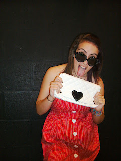
 However, I took a lot of time to concider the genre and theme of my magazine here and chose costume and props which I thought would be suitable for my target audience and the genres that appealed to them. I also made sure that the photo was of a decent quality, for example, no objects in the background, no flashes on the photo, etc.


What have you learnt about technologies from the process of constructing this product?

During the making of my magazine, I used a number of programs such as Adobe Paintshop and Adobe Indesign.


I used Paintshop to produce my front cover and my contents page. I made a number of mastheads for my magazines using different fonts and colours and then asked members of my target audience which they preffered to then end up with my final masthead. I also used Paintshop to cut around my cover image and the images on my double page spread the pen tool. This was really helpful as it helped to acheive a more proffesional end result. Paintshop was a good program to use for the creative aspects of my magazine such as mastheads, headings, effects and also editing any images to make them look more proffesional and suitable for my magazine.
 Above are two examples of mastheads which I created using Adobe Photoshop.

I also used Adobe Indesign to put my double page spread together. This program really helped as it was easy to place the features of my double page spread onto the two pages, such as text, photos and any headings (which I made on photoshop).


Above is my double page spread which I created using Adobe Indesign.


I found photoshop easy to use and quickly learnt some skills which I used throughout the making of my magazine, for example, shadowing and outerglow, which are common aspects of my magazine. I also found the manipulation of photos helpful, for example, turning photos from colour to greyscale, but with the same good quality. I needed to use this manipulation for the images on my contents page, as I used all greyscale photos:


I feel that the above image looks for effective in greyscale, and also suited to the colour scheme of my magazine better in greyscale than in colour. Without photoshop, I wouldn't have been able to manipulate the images successfully. I manipulated many of the images I used throughout my magazine, sometimes just subtly like editing the contrast for example. Photoshop allowed me to make my magazine more professional and look more realistic by allowing me to edit the photos to make them look a better quality.

I also made the blend for my double page spread on photoshop:

Without photoshop, I wouldn't have been able to group the photos together. I also would not have been able to cut around the individual images with such prescision. I also used the blur tool to go around the edge of each photo to make it look smoother and less jagged from the cut tool. This made it look much more professional.

Overall, I found both Indesign and Photoshop helpful programs to use, however, Indesign was more difficult to use, but ensured that my double page spread looked tidy - Indesign allows you to line up your text in collumns exactly, so it looks professional and realistic.

Wednesday 24 November 2010

How did you attract/address your audience?

I attracted my target audience to my magazine by taking the information from my primary and secondary research, for example, many of the people who took my questionnaire said they like big bold fonts and bright colours, so I therefore made sure these were features of my magazine.

As my target audience are male and female teenagers, I tried my best to use gender friendly colours such as red, because I feel borth genders will be attracted to this colour. I also made sure that my cover features were both youthful and fun and stood out to teenagers, as well as music fans. My cover image was also important as this is the standout image of my magazine so I made the photo fun and colourful to attract my target audience.

I also feel that using plugs and pugs attracted my audience as the majority of those who took my questionnaire said they liked the chance to win things (be entered into competitions) or to be given free gifts in the magazine. In my magazine, I used the following plugs:

This was included on my contents page, and it was also mentioned on my front cover - reoccuring use of plugs makes the magazine more marketable as it keeps reminding the reader what the magazine is offering.

I chose colours that I thought would appeal to my target audience to use throught my magazine. Red was my main bold colour which I used for my masthead and other headings and main text. I used this because it is bright and eye-catching, and also gender friendly which is important for my target audience of male and female teenagers. I decided to use simple black, white and grey to contrast with the red, as I thought this contrasted well making the red stand out even more but the monochrome colours keep the simplicity of the magazine and ensure that it looks professional. I also used some blue text on my front cover, as I felt blue fitted well with the red.

The features I used in my magazine were aimed at 'young music fans'. I used then phrases 'new' and 'upcoming' to show that the features were the latest news which I think appeals to my target audience of teenagers because, as a teenager myself, I can say that most teens like to know the latest news about their interests (in this case, music). 


For example, above is my contents page. I have added a number of interviews and reviews, which I thought would appeal to my target audience and music fans.

The genres I chose to use were Pop/Dance/RnB. I chose these three genres as, after much analysis of magazines, I felt there wasn't many magazines of this genre on the market. I also chose these genres because I think many male and female teenagers like this type of music (I also conducted a questionnaire which shows this):


This graph shows that the majority of those I asked in my questionnaire, who were my target audience, said their favourite genres of music were Pop, Dance and RnB, so this is why I decided to use this genre for my magazine.

I decided on the price of my magazine by asking my target audience the price they would be willing to pay.

I was considerate of the price, as a too expensive price wouldn't be suitable for my target audience - most teenagers are students, so don't have full time jobs or a job at all, so will not be willing to pay a lot for a magazine, especially if it is published weekly or fortnightly. My magazine is £2.30, which I think is reasonable for a monthly music magazine.


Tuesday 23 November 2010

Who would be the audience for your media product?

I decided to aim my magazine at both male and female teenagers (about the ages of 15 - 17). I chose this as the majority of people who took part in my primary and secondary research were of this age so I therefore had opinions and information from this group of people.

In order for my magazine to appeal to my target audience, I have used bright, bold colours, with large headings that stand out. I have also included articles I think would appeal to my target audience and music fans, as I feel this is important in attracting attention to the magazine. I have also ensured that I have included a competition - my research showed that the majority of my target audience were attracted to magazines which offered them the chance to win something so I made sure this was a part of my magazine, along with a number of other plugs and pugs. I also made the cover image fun and colourful, as I feel these two factors appeal to teenagers.

Although my magazine is aimed at male and female teenagers, I feel that it is also suitable for a slightly older audience because they would be attracted to the articles included (because I feel that they will be liked judged on the person's love of music, not their age). I also think that the layout and colours used are quite mature - although I have used bright, attractive colours, it is not too loud or over the top, and still looks proffesional. Therefore, I think that a slightly older audience would also enjoy my magazine.

I decided to aim my magazine at a teenage audience because I found it easy to relate to that age range because I am that age. I'm also a fan of music so I understood the needs and wants of a music magazine reader, for example, they often want the best, newest information and the upcoming events, etc.

The image to the left shows a part of my front cover. This is aimed at my audience as teenagers often like to know the latest new information and to be ahead of the game.

As someone who buys quite a lot of magazines, I found it quite easy to analyse and judge a number of magazines, as I already knew what I liked best and what factors appealed to me. This also helped because I knew many basic factors of a magazine, such as use of image and advertisements (plugs).


What kind of media institution might distribute your media product and why?

I think my magazine would most likely be distributed in shops such as newsagents, supermarkets, book shops, music shops, etc. This is because these places are most likely to sell music magazines, especially music shops because they normally have a wider range of music magazines than newsagents or supermarkets. I think my magazine would be suitable to be sold in these places as I feel it is a different type of magazine compared to some that are out at the moment - for example, it has three genres instead of just one, and because it is a music magazine, this also makes it less likely to be sold in mainstream stores such as supermarkets.

I could also imagine my magazine to be sold maybe at concerts/gigs, especially if the artist playing was featured on the cover of my magazine. This would ensure publicity for both the artist and the magazine.

Another way in which my magazine could be sold is the double promotion packed magazine, where two magazines of a similar genre are sold together at a special price. This is a good idea, especially if a new magazine is paired with an already popular magazine, as this would gain publicity for the new magazine. One example of this is Heat and Closer magazine, which are also sold in a double pack at a promotion price.

Another way my magazine could be sold is by the use of subcribtions. For example, a pug could be added to the magazine advertising a reduced price - for example, a yearly subscription at a reduced price and delivered to the customers door would be appealing to a reader. Another way subscribtions could be advertised is by putting a leaflet in the magazine.

Another effective way in which my magazine could be advertised could be a 'webazine' or website for the magazine. Many magazines actually have websites to go with their magazine, and readers can become members and are often given the chance to be entered into competitions and get newsletters. One example of a 'webazine' is NME's magazine website, which is pictured below:


How does your media product represent particular social groups?

I think my magazine is suitable to a range of different social groups, even though my target audience is  male and female teenagers (15-17 year olds). Although this is the audience I decided to design my magazine for, I feel that it is also suitable for other age groups such as a slightly older age group: 20-25 year olds perhaps. I think this because some of the articles I have chosen to include in my magazine are quite mature and are suitable for any music fan of this specific genre. I also feel that it could be suited to an oldr audience because of the simple layout I have used, which indicates maturity.


The images I have used in my magazine are aimed at male and female teenagers as this is the target audience I chose to represent. I think I have conveyed this by the style of images I have used, for example, my cover image is bright and fun, which relates to the youth of today.

I also think the general appearance of my magazine cover gives the impression of youth. For example, bright colours are used with lots of effects such as shadowing and outer glows around the masthead and headings. After analysing music magazines, I found that mamy magazines aimed at an older audience such as 'Classic Rock' used much more simple fonts and less bright, vibrant colours so I decided to go against this and use youthful looking colours and effects to create the impression of fun which I think relates to my target audience.


The fonts I chose to use also relate well to my target audience:  
Poplar STD is quite a rounded font and it looks really fun and quirky, which is why I decided to use it as I thought it would appeal to my target audience. Also, the bright red colour I have used also makes it look young and fun because it stands out well and is eye-catching. However, I also think this font is generall quite a simple font, so it may also appeal to an older audience.

Another factor which may appeal to my target audience is the features I have chosen to include in my magazine. For example, I have added interviews with 'new and upcoming artists' which would appeal to any music fan but especially young music fans as they are known to like to know whats happening as soon as it happens. However, I think the features included could appeal to any music fan if it was an artist they were interested in.

Friday 19 November 2010

In what way does your media product use, develop or challenge forms and conventions of real media products?


My media product, which was a music magazine, uses but also challenges many forms of a real music magazine. For example, I ensured that I used popular factors used by the majority of music magazines, such as mastheads, plugs and pugs, photos, etc. Because the majority of popular, best selling magazines use these techniques I felt that it would be useful to use them too, to ensure my magazine was of a high standard and appealed to my target audience. However, some aspects of my magazine differed to the majority of music magazines; I decided to base my magazine around a number of genres: Pop, RnB and Dance. I decided on this because I felt there wasn't a particular magazine that was aimed at those who like these three genres - the majority just focus on one specific genre.

I found that analysising a range of music magazines helped me to gain knowledge of what factors were used in the making of these magazines, which allowed me to use some of these techniques to benefit my own magazine. For example, I noticed that many music magazines used lots of plugs to attract their audience, so I decided to use a range of plugs to ensure that I had the same effect.

Other factors I used that are similar to real life magazines are the use of my central image. Before I shot my central image, I collected a number of photos which inspired me for the shoot to give me an idea of what I wanted my central image to look like:


I took inspiration from this photo of Katy Perry as it was the type of fun, youthful shot I thought my target audience would be attracted to. Also, Katy Perry is a famous dance/pop artist, which is what I made my cover star.

I also used a wide range of pugs/plugs throughout my magazine. After much analysis of music magazines, I discovered that each and every magazine I analysed had at least one plug so I thought this was an important factor that needed to be included on my magazine in order for it to come across as realistic and for it appeal to my target audience.

This is one example of a plug which was used on my front cover.

I also used pugs such as barcode, price, date, issue, etc. I think these factors are important to the magazine because, although they are simple and don't normally fit with the design of the magazine, they add to the professionalism and give the reader essential details that are needed.

After analysing a number of music magazines, I saw that many used a reoccuring colour scheme. I think this looks professional and tidy, so I decided to do this also, choosing the colours for my magazine carefully and making sure that the colours I chose to use were appealing to my male and female target audience. I decided to use red for my stand out, vibrant colour as I feel red is eye catching and bright, and is also a unisex colour so would therefore appeal to both genders. As well as colour, images were important to my magazine because I noticed in my magazine analysis that many magazines don't use lots of photos, but they use important photos and more text - for example, NME often uses one photo to illustrate an interview. So, as I was using a limited amount of photos, I felt it was important to choose the right photos and the right way of publishing them. For example, I ensured that my cover image was the strongest of the photos I had taken on my shoot. I also ensured that the masthead, headings, text, etc went well with the cover image as this is the central factor of the magazine cover and therefore the other factors need to work well with it. On my contents page, I decided to use grayscale photos as I feel this looked more effective and professional than in colour, and they also went well with the colour scheme on my contents page.

I didn't tend to vary my font much throught my magazine, as the majority of magazines I analysed used reoccuring fonts which, again, I think reinforced the professionalism of the magazine. However, those that used lots of busy, bright fonts looked too childish and unprofessional so I decided to keep to using two fonts: Poplar STD for my masthead and my headings and Georgia for my text such as the interview on my double page spread.

 
I would also say that my media product compare well to a real media product, as I think I have created a realistic music magazine of my desired genre. By using factors such as an eye catching masthead, various plugs and pugs such as quotes, advertisments for competitions, etc, I think I have managed to make a believable music magazine. Whilst analysing a number of music magazines, I found that many used a reoccuring style/colourt scheme throughout their magazine. Throughout my magazine, I have ensured that I have used the same fonts and similar colours because I think this creates an appealing look and is well suited to my target audience.